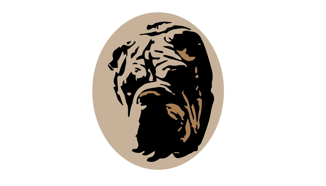
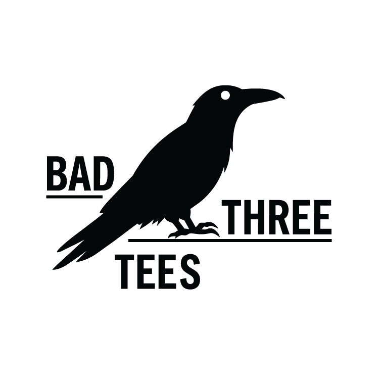
Main Logo

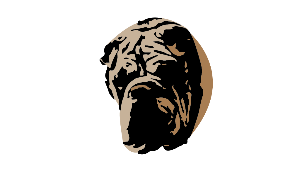
Secondary Logo
Logo Development:
I wanted the Bad Three Tees identity to feel bold, unconventional, and slightly rebellious. I developed the crow as the central symbol of the brand, giving the identity a distinctive visual element that could work beyond the full logo. Bold, condensed typography gives the name a strong presence, while the unconventional arrangement of “BAD,” “THREE,” and “TEES” allows the typography and crow to function as one cohesive graphic. The underlines provide structure and balance to the composition.

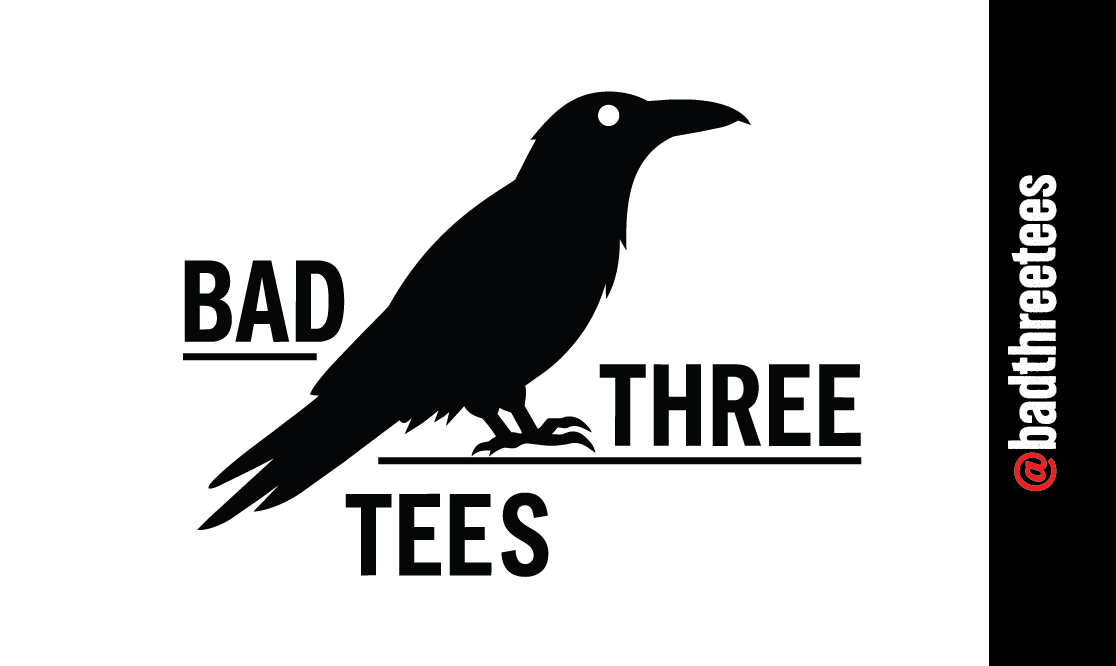
Business Card Development:
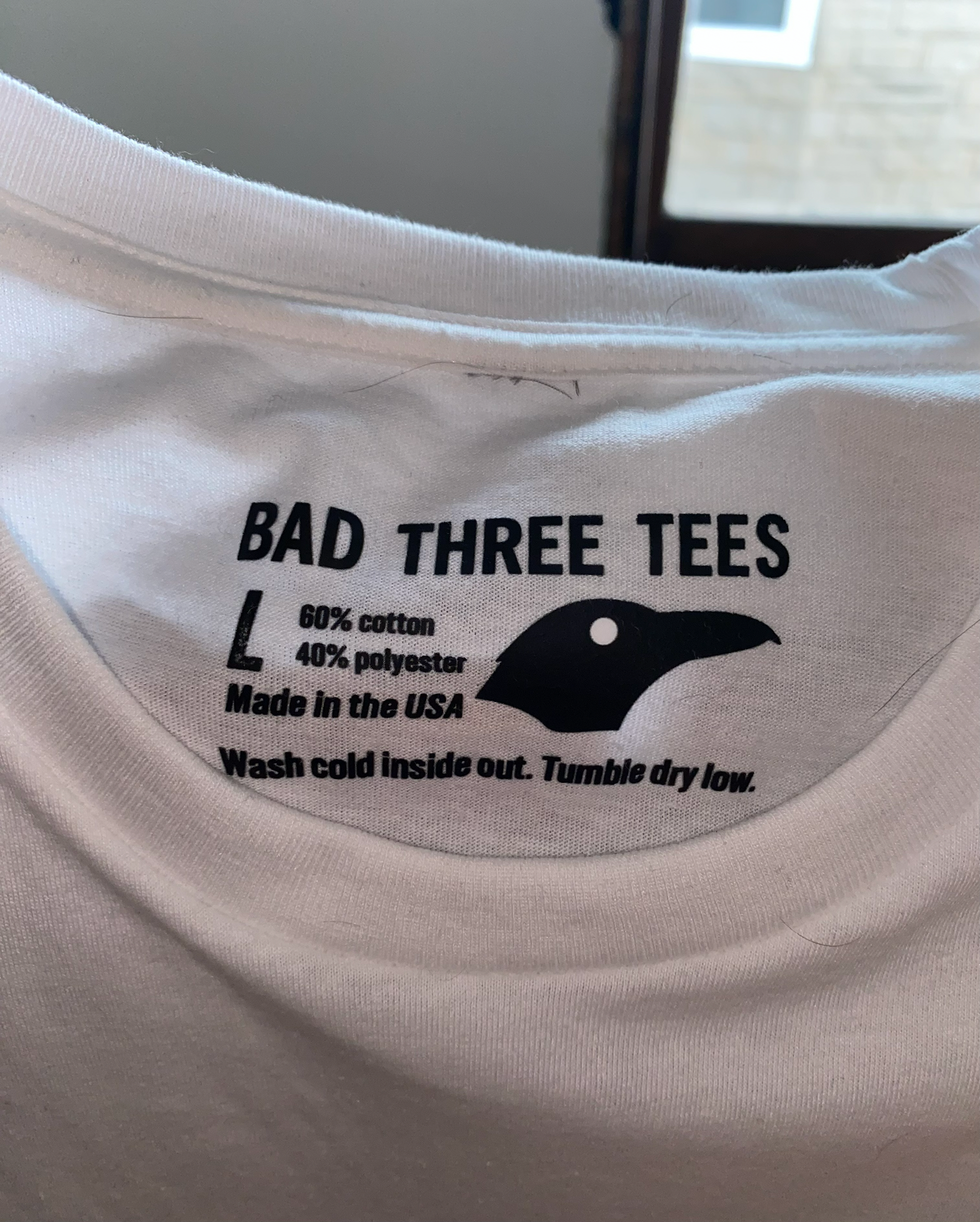
I designed the Bad Three Tees business card as a physical extension of the brand identity. The card carries the bold typography and distinctive crow imagery established in the logo system while balancing brand recognition with practical business information. The design demonstrates how the identity can remain cohesive across different physical touchpoints, from business cards and hang tags to apparel and packaging.
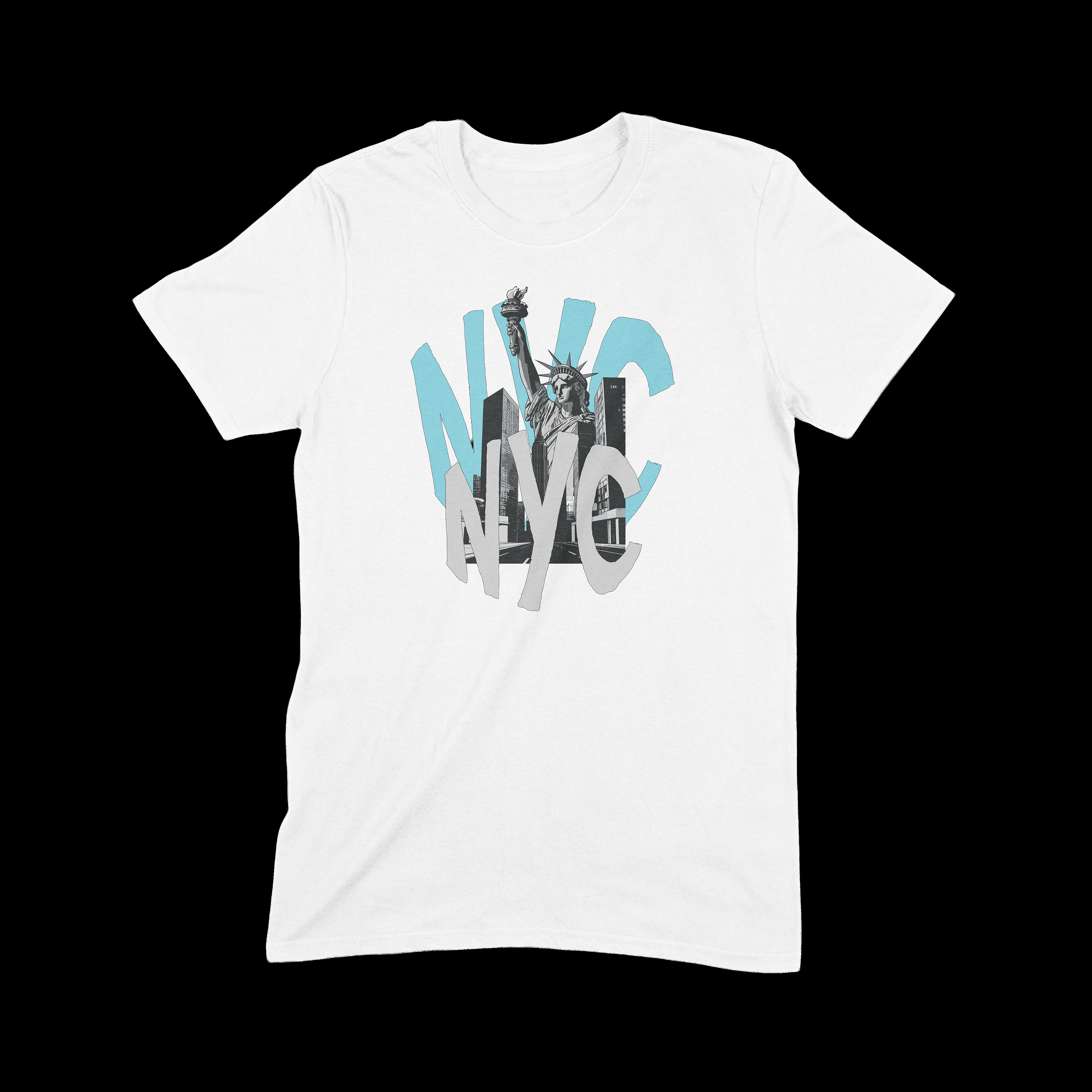

NYC Shirt:
I created the NYC shirt as the first design in Bad Three Tees’ vacation shirt series. The design explores how the brand could combine recognizable locations with its own visual style, helping establish the direction for future destination-based designs.